Naming,Branding, UX, UI, Website
ABOUT CANNABMED
Cannabmed is a project by the non-profit ICEERS about medicinal Canna. Cannabmed is a community engagement for patients who use canna. The objective is to disseminate accurate information, as well as to provide resources for the community.
THE STRATEGY
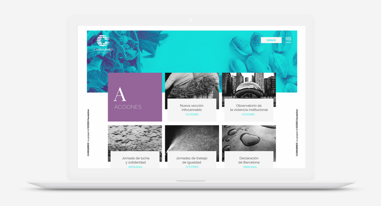
Our value proposition was to be able to place the brand in a space differentiated from recreational canna use. We present science through cold colors and the logo is grounded in the idea of community, since one of the project’s objectives is to make visible the problems that canna therapeutic users experience in their daily lives.

THE SCIENCE APPROACH
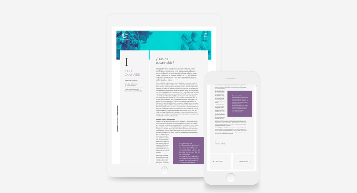
The website is focused on reflecting the scientific quality of its content. Inspiration is based on scientific publications. Given the amount text, a delicate typographical work has been chosen for comfortable reading.

COLORS
A color palette was chosen to reflect the scientific tone of the project. Based on the iconic green of Cannabis we have moved towards more bluish tones to create a strong personality.
Aquamarine
#007eff
Byzantium
#c62a41
Night Sky
#333437


